🎬 The Whole Game, Part 2: Visualize, Export & Name the Workflow
In Part 1 you turned a raw file into a twelve-number monthly climate summary. Now you will finish the game. You will visualize those numbers, save your results, and put a name to the ten-step workflow you just played through.
Same idea as Part 1 🚀
This is still a preview, so keep working the same way: copy a cell, run it, then change one thing. You will learn how visualization really works on Day 7. Today, just enjoy turning numbers into a picture.
Getting Started
Set up your notebook with the usual ritual:
Create a new notebook (+ → Notebook → eds217_2026).
Rename it to Session_1D_Whole_Game_2.ipynb.
Add a title cell (Markdown), updating the date:
# Day 1: Session 1D - The Whole Game, Part 2[Session Webpage](https://eds-217-essential-python.github.io/course-materials/interactive-sessions/1d_whole_game_2.html)Date: 08/31/2026
Pick up where Part 1 left off
We are in a fresh notebook, so first re-run the workflow from Part 1 to rebuild df and monthly_means.
✅ Canonical cell. Copy and run it exactly:
Code
import pandas as pdimport matplotlib.pyplot as plturl ="https://eds-217-essential-python.github.io/data/toolik_weather.csv"df = pd.read_csv(url)monthly = df.groupby('Month')monthly_means = monthly['Daily_AirTemp_Mean_C'].mean()
Step 6: Visualize 📊
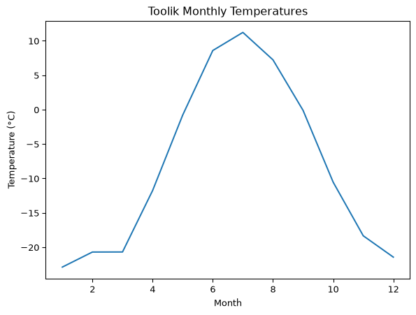
Visualize means turning numbers into a picture you can read quickly. The simplest plot is a line plot with plt.plot().
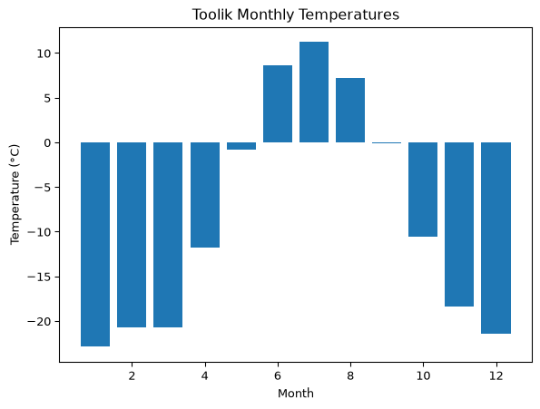
The same twelve numbers now show a clear seasonal cycle. We can also draw them as bars with plt.bar(). Copy the first line exactly. The month numbers for the x-axis come straight from your monthly_means.
Change only a label. The data stays exactly the same. Pick one new title from this menu and re-run:
plt.title("Average Temperature by Month")
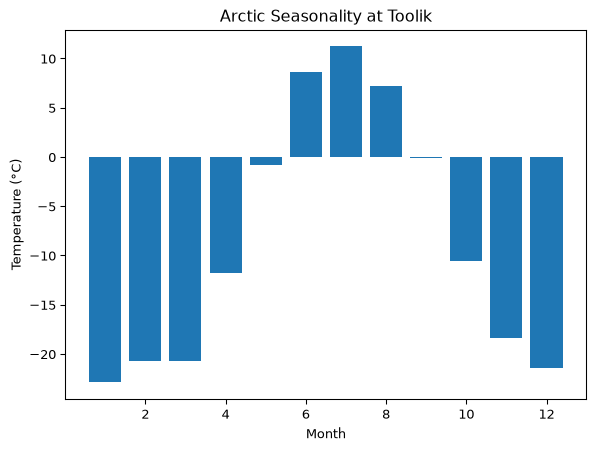
plt.title("Arctic Seasonality at Toolik")
plt.title("Monthly Mean Air Temperature, 1988 to 2018")
You could reword the plt.ylabel(...) text instead. Either way, change just one thing.
Code
# 🔁 Example: same plot, one new label. The data (monthly_means) stays the same.plt.bar(monthly_means.index, monthly_means)plt.title("Arctic Seasonality at Toolik")plt.xlabel("Month")plt.ylabel("Temperature (°C)")plt.show()
✍️ Say it in a sentence (required)
Read the coldest month’s value off your chart, then report it in an f-string. For example:
coldest =-22.9# January's value, read from the chartprint(f"Toolik's coldest month averages about {coldest} degrees Celsius.")
Now write one more sentence comparing it to the warmest month.
Step 7: Export 💾
Export means saving your results so you or a collaborator can use them later. This is the foundation of reproducible science. monthly_means.to_csv(...) writes your summary to a file.
✅ Canonical cell. Copy and run it exactly (in your notebook):
Same data, new file. Your monthly_means in memory stays the same.
✍️ Say it in a sentence (optional)
Name what you saved. For example, set filename = "monthly_means.csv" and then print f"I saved my results to {filename}."
Naming the whole game: the 10-step workflow
You just did it. Here is the workflow you played through, named in full. Every analysis in this course, and in your career, is some path through these ten steps:
flowchart LR
    A["1. Import 📂"] --> B["2. Explore 🔍"] --> C["3. Clean 🧹"]
    C --> D["4. Filter 🎯"] --> E["5. Sort 📊"] --> F["6. Transform 🔧"]
    F --> G["7. Group 👥"] --> H["8. Aggregate 📈"] --> I["9. Join / Reshape 🔗"]
    I --> J["10. Visualize 📊"]
Today you traveled Import → Explore → Group → Aggregate → Visualize → Export, skipping the steps we have not taught yet. That is normal. Few analyses use every step, and they always happen in this order.
📖 Read more:The Data Science Workflow gives a one-sentence description of each step and shows which day you will learn it.
🗓️ Coming Attractions
Every “code stranger” you met today becomes a friend on a specific day:
Step
What it does
You’ll learn it on
1. Import
Load data into a DataFrame
Day 2
2. Explore
Get to know the table
Day 2
3. Clean
Fix missing values, types, duplicates
Day 4
4. Filter
Keep only the rows you want
Day 3
5. Sort
Order rows by a column
Day 3
6. Transform
Build new columns
Day 4
7. Group
Split rows into buckets by a key
Day 5
8. Aggregate
Collapse each bucket to a number
Day 5
9. Join / Reshape
Combine tables; add a time dimension
Day 6
10. Visualize
Turn numbers into pictures
Day 7
🧪 Sandbox (5 minutes)
Play. Re-title a plot, swap plt.plot for plt.bar, save under a silly file name, or break something on purpose. Errors are expected and welcome today. They are how you find the edges.
↩︎️ Canonical restart. Run this to rejoin the group
When time is up, run this to reload the data and rebuild your results from scratch:
Code
# Restart: reload df and rebuild the canonical resultsdf = pd.read_csv(url)monthly = df.groupby('Month')monthly_means = monthly['Daily_AirTemp_Mean_C'].mean()
Key Points
Visualize with plt.plot() and plt.bar(). Label with plt.title(), plt.xlabel(), and plt.ylabel(). Today you change labels only.
Export results with .to_csv("filename.csv") so your work is saved and reproducible.
The complete ten-step workflow is Import, Explore, Clean, Filter, Sort, Transform, Group, Aggregate, Join/Reshape, and Visualize.
You now know the shape of the whole course. Each of the next six days teaches a piece of this same workflow.