Code
import pandas as pd
import matplotlib.pyplot as plt
import seaborn as sns
url = 'https://eds-217-essential-python.github.io/data/penguins.csv'
penguins = pd.read_csv(url)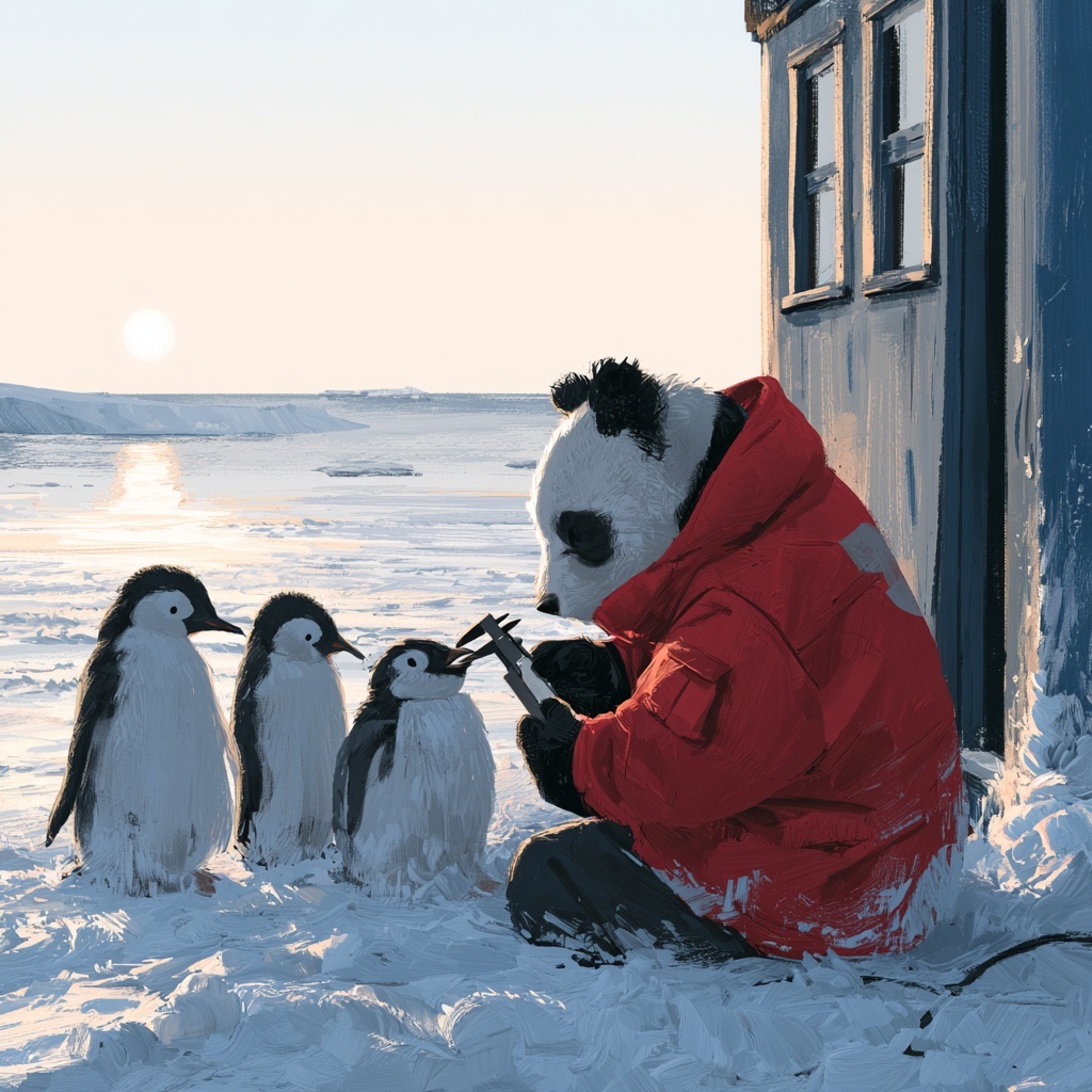
A panda, measuring three different penguins. MidJourney 5
Between 2007 and 2009, researchers at the Palmer Station on the Antarctic Peninsula measured 344 penguins of three species: Adélie, Chinstrap and Gentoo. For each bird they recorded four numbers, the island it was caught on, and its biological sex.
The resulting file is small, and relatively clean by the standards of anything you have opened this week. It also holds a relationship between two of the bill measurements that runs one way within each species and the other way across all three at once, and a table of means of those same columns points at the wrong one of those two directions.
This afternoon we will build the figure that separates them, one plot at a time, using the plotting patterns from this morning.
Work in pairs, in one shared notebook, taking turns at the keyboard. Swap every time you finish a numbered task. The person not typing should read through the output (quietly) and explain what the code should produce/calculate before you run it.
We have about 45 minutes for this activity: roughly 40 on the four parts below, and the rest on setting up and on the wrap-up. The times in the headings are rough guides, so please let Cella or Kelly know if you and your partner are getting stuck on any of the tasks!
Every plotting pattern we need this afternoon comes from this morning’s session.
sns.scatterplot(data=df, x='col', y='col')             # one measurement against another
sns.histplot(data=df, x='col')                         # the distribution of one column
sns.barplot(x=series.values, y=series.index)           # a grouped Series, as bars

hue='col'                                              # works on all three
In addition, we will need to work with the matplotlib figure frame:
plt.figure(figsize=(w, h))
plt.xlabel(...) ; plt.ylabel(...) ; plt.title(...)
plt.tight_layout()
Finally, we will also need these cleaning, grouping, selection, and sorting patterns, all from earlier in the week:
df.dropna()
df.groupby('key')['column'].agg(['count', 'mean'])
df['column'].value_counts()
df.sort_values('column', ascending=False)Create a notebook named Colab_7C_Penguins.ipynb, with both partners’ names in the title cell, then read the file:
import pandas as pd
import matplotlib.pyplot as plt
import seaborn as sns

url = 'https://eds-217-essential-python.github.io/data/penguins.csv'
penguins = pd.read_csv(url)Answer each question with code, then write the answer in a markdown cell underneath, in a complete sentence with the numbers in it.
How many rows and columns? What are the column names, and which are numeric?
Count the rows for each species, and separately for each island. Which species is rarest, and which island has the most birds?
Run .isnull().sum(). Two different things are going on in that output. Say what each one probably is.
Build a clean table called birds by dropping every row with any missing value, and report how many rows you lost. Then re-run the species counts on birds and say whether the losses fell evenly across the three species.
Draw a histogram of flipper_length_mm for the whole table. Label the x-axis with units and give the figure a title. Describe the shape in one sentence.
Draw it again, split by species. In a markdown cell, say what the two humps in question 5 turned out to be, and whether “the average penguin has a flipper of about 201 mm” is a useful sentence.
Pick one of bill_length_mm, bill_depth_mm or body_mass_g and do the same pair of figures for it. Does that measurement separate the species as cleanly as flipper length does?
Part 3 is where the afternoon’s result shows up, so please work through it in order, and do not skip question 9!
Draw a scatter plot of body_mass_g against flipper_length_mm, with flipper length across the bottom. Label both axes and title it. Describe the relationship in one sentence.
Draw the same figure with hue='species'. Does adding the species change what you would say about the relationship, or just make it prettier? One sentence.
Now a different pair of columns. Draw a scatter plot of bill_depth_mm against bill_length_mm, with bill length across the bottom, and no hue=. Label it.
Before you go on, write down in a markdown cell what this figure says: as a penguin’s bill gets longer, does it get deeper or shallower?
Draw it once more with hue='species'.
Read your answer to question 10 back, and then look at question 11. Within each of the three species, longer bills go with deeper bills. Across all three together, longer bills go with shallower ones.
In a markdown cell of four or five sentences: explain how both of those can be true at once. Your explanation should mention where the three species sit relative to each other, and it should not use the word “wrong” about either figure.
A relationship that runs one way inside every group and the other way across the pooled data is called Simpson’s paradox. It is one of the most common ways that a perfectly correct summary of a dataset can produce a conclusion that is the reverse of the truth. It can show up whenever the groups differ both in what you are measuring and in how many of them there are.
One argument, hue='species', is what makes it visible here. Without the figure, you would have had to suspect the pattern before you could go looking for it!
Build a Series of mean body_mass_g by species, sorted from heaviest to lightest, and draw it as horizontal bars using the .values and .index idiom. Label both axes and title it.
Two of those three bars are nearly the same height. Look back at your figure from question 11. In one sentence: would you say those two species are similar birds?
Run .agg(['count', 'mean']) on the same grouping and print it. Then build a Series of the number of birds on each island with .value_counts(), and draw that as horizontal bars too.
Draw a bar chart of mean body_mass_g by species, split by sex. The data= form is easier here, because you want two bars per species: sns.barplot(data=birds, x='species', y='body_mass_g', hue='sex').
Then report in one sentence what the sex split adds to your answer to question 14.
This is the last task, and it is a bit of a trap (sorry!). Build a wide table with species down the rows, island across the columns, and a count of body_mass_g in the cells. You built the pivot pattern yesterday morning; add aggfunc='count' to it.
In a markdown cell, using two or three sentences answer the following: given that table, what might go wrong if somebody used this dataset to compare Biscoe island with Dream island?
Check that:
hue= did in each of the three kinds of plot we used it in