In our first session this morning we drew every figure by handing matplotlib two sequences of numbers and then describing, one command at a time, what we wanted done to them.
Naming each command works, and it is worth knowing, because underneath every Python figure you will ever make there is a matplotlib figure and a matplotlib axes.
seaborn takes a different approach. You hand over the whole table plus the names of the columns you want plotted, and seaborn does the drawing. Because the whole table went in, seaborn can also use the columns you did not plot, including the one that says which group each row belongs to.
By the end of this morning’s session you will be able to:
write the three seaborn calls this course uses: sns.scatterplot, sns.histplot and sns.barplot
pass a whole table with data= and name the columns with x= and y=
split any of those three plots by a categorical column with hue=, and read the result
feed a grouped Series to sns.barplot using its .values and its .index
keep using every matplotlib command from our first session on a seaborn figure
Getting Started
Create the file. In the Explorer, hover over the EDS217 heading and click New File…, then type the name in full, extension included: Session_7B_Seaborn.ipynb
Check the kernel. The Kernel Selector in the notebook’s action bar should read Python 3.11.15 (Conda: eds217). If it reads anything else, click it, choose Change Kernel, and pick the eds217 entry.
Add a title cell. Click + Markdown in the action bar, and give it this content, with today’s date:
# Day 7: Session 7B - Name the Columns, Not the Colours[Session Webpage](https://eds-217-essential-python.github.io/course-materials/interactive-sessions/7b_seaborn.html)Date: 09/09/2026
Save with Ctrl + S (Cmd + S on macOS), and keep saving as you go.
Rebuild the clean stream-chemistry table. Every line below is one we have run before, in Thursday’s colab and again in 5A:
We end up with 255 rows from six sites, collected over the 2025 field season. Each row is one sample, with four measurements on it: temperature, pH, dissolved oxygen and conductivity.
The standard import line is import seaborn as sns, and sns is as fixed a convention as pd and plt. Most people (and even many bots!) assume there is no reason for this, but true West Wing fans know the truth.
The same figure, made two ways
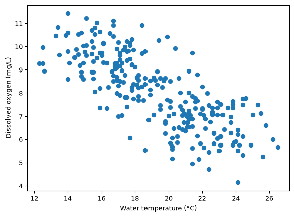
Here is a scatter of water temperature against dissolved oxygen, drawn the way we drew things in our first session this morning:
Code
plt.figure(figsize=(7, 5))plt.scatter(survey['temperature_c'], survey['dissolved_oxygen_mg_L'])plt.xlabel('Water temperature (°C)')plt.ylabel('Dissolved oxygen (mg/L)')plt.show()
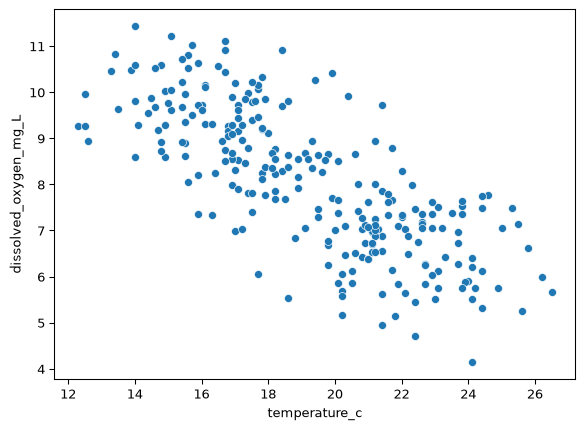
sns.scatterplot(data=df, x='column_name', y='column_name')# ↑ ↑ ↑# the which column which column# table across up
Three differences between the two calls:
data= takes the whole table, once.
x= and y= take column names as strings, not the columns themselves.
The axes came out labelled, because the column names went in with the table. Nothing in the matplotlib version ever mentioned a column name
The free labels are a small convenience and a large hint. seaborn is built on the assumption that your data arrives as a tidy table, and it uses everything in that table, column names included, to make decisions you would otherwise have to make by hand.
Note
🐍 Column names are not automatically good axis labels. temperature_c is a variable name; Water temperature (°C) is a label. Every labelling command from our first session still works, so override the defaults whenever you would show the figure to somebody:
sns.scatterplot(data=survey, x='temperature_c', y='dissolved_oxygen_mg_L')plt.xlabel('Water temperature (°C)')plt.ylabel('Dissolved oxygen (mg/L)')
Or… give your columns expressive names! With auto-complete in most IDEs, it isn’t that much of a pain to use a well-formatted column in your workflows.
hue=, and what a table cannot show you
On Friday morning we computed two small tables from this file and read them side by side:
Two orderings of six sites, and one is the exact reverse of the other. We concluded, correctly, that the warm sites are the low-oxygen sites, and the whole of the evidence was two short lists that read in opposite directions.
Now add one argument to the scatter you already made:
Code
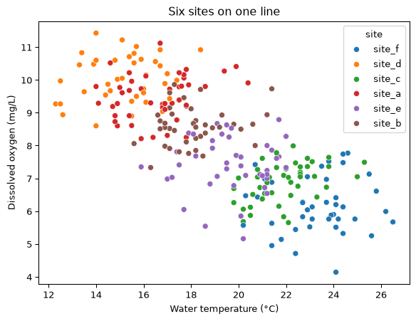
plt.figure(figsize=(7, 5))sns.scatterplot(data=survey, x='temperature_c', y='dissolved_oxygen_mg_L', hue='site')plt.xlabel('Water temperature (°C)')plt.ylabel('Dissolved oxygen (mg/L)')plt.title('Six sites on one line')plt.show()
hue= takes a column name and gives every distinct value in that column its own colour, with a legend built for free.
Read what came back. The six sites are not scattered through the cloud; they are laid out along it, in order, from site_d in the cool oxygen-rich corner to site_f in the warm oxygen-poor one, with site_a, site_b, site_e and site_c strung between them in exactly the order the two tables gave.
The tables told us that six sites have six means. The figure shows that all 255 samples, from all six sites, lie along one relationship, and that the sites differ because they sit at different places on it. The second claim is both stronger and different in kind, and it is the sort of claim a picture of every sample can support and a table of six group means cannot.
hue= is the argument you came for
A great many questions in environmental data science come down to does this relationship differ between groups? Sites, species, seasons, treatments, oceans, decades.
hue= is how you ask it, and it works the same way on all three of the functions below. When you have a figure and a categorical column, try hue= before you try anything else.
✏️ Test your knowledge
Write a seaborn scatter plot of conductivity_uS_cm against dissolved_oxygen_mg_L, coloured by site, inside a figure eight inches by five. Label both axes with units and give it a title.
Then, in a markdown cell: do the sites separate as cleanly here as they did for temperature? Name one thing this figure tells you about the six streams that the temperature figure did not.
sns.histplot: the shape of one column
A scatter needs two variables. When you have one variable and want to know how its values are distributed, you want a histogram: the values sorted into bins, with a bar showing how many values are in each bin.
Code
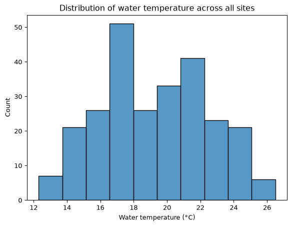
plt.figure(figsize=(7, 5))sns.histplot(data=survey, x='temperature_c')plt.xlabel('Water temperature (°C)')plt.title('Distribution of water temperature across all sites')plt.show()
data= and x=, and no y=, because the height of each bar is a count that seaborn computes for you. The picture is the same kind plt.hist() drew in a boxed note on Thursday, now with a name and an argument you can use.
And hue= works here too:
Code
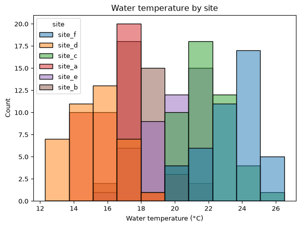
plt.figure(figsize=(7, 5))sns.histplot(data=survey, x='temperature_c', hue='site')plt.xlabel('Water temperature (°C)')plt.title('Water temperature by site')plt.show()
One broad hump has become six narrow ones, mostly side by side. The undivided histogram looked like one population with a wide spread, and the split version shows six streams instead, each fairly consistent, and each sitting at a different temperature.
A histogram of a column that mixes groups almost always looks wider and vaguer than any of the groups in it. Splitting by hue= is how you find out whether the width is variability or structure.
✏️ Test your knowledge
Draw a histogram of pH, then draw it again with hue='site'. Label the axes.
In a markdown cell, say whether pH separates the sites as sharply as temperature did, and what that means for the ph_class column you built on Thursday: is it labelling chemistry, or is it labelling which stream the bottle came from?
sns.barplot, and the Series idiom
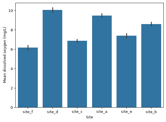
A bar chart compares one number per category, which makes it the natural picture for the output of a .groupby(). seaborn will do the whole thing in a single line:
Six bars, and we never called .groupby(). Given a categorical x= and a numeric y=, sns.barplot groups the table by x and draws the mean of y for each group.
The convenience comes with two things you did not ask for.
The little black line on each bar is a measure of how uncertain that mean is, computed by resampling the data hundreds of times. Showing uncertainty is a reasonable thing to want to do, but we have not covered what the interval means, and a figure with something in it that you cannot explain to a reader is a habit worth avoiding.
And the bars are in whatever order the sites appear in the file, which is no order at all.
The alternative is to compute the number yourself, with Friday’s split-apply-combine pattern, and hand seaborn the answer:
The result is a Series: six values, indexed by site name. A Series holds its numbers in .values and its labels in .index, which are exactly the two things a bar chart needs.
Code
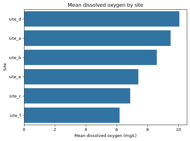
plt.figure(figsize=(7, 5))sns.barplot(x=mean_do.values, y=mean_do.index)plt.xlabel('Mean dissolved oxygen (mg/L)')plt.ylabel('Site')plt.title('Mean dissolved oxygen by site')plt.show()
sns.barplot(x=series.values, y=series.index) # horizontal bars, sorted as you sorted themsns.barplot(y=series.values, x=series.index) # vertical bars, same data
Learn the two-argument call as one unit. The pattern connects a week of table-shaping to the pictures we make of the results, and you will type it constantly:
group, aggregate, sort, then plot the .values against the .index.
Three things came out of doing it the long way. The bars are in the order you sorted them, so the figure ranks the sites. There is no uncertainty interval, because you drew a mean and only a mean. And putting the values on x= and the labels on y= makes the bars horizontal, so the site labels read left to right instead of needing rotation. With site labels longer than the six short ones here, the horizontal layout stops being cosmetic.
Note
🐍 Note what this cell did not need. No data=, because there is no table: a Series is not a DataFrame, and .values and .index are two plain sequences. Passing them directly is the one place in today’s lesson where we go back to handing seaborn raw numbers, and the option is worth knowing about.
✏️ Test your knowledge
Build a Series of mean conductivity_uS_cm by site, sorted from highest to lowest, and draw it as horizontal bars using the .values and .index idiom. Label both axes with units, give the figure a title, and end the cell with plt.tight_layout().
Then compare it with the dissolved-oxygen ranking above. Do the two orderings agree, disagree, or neither? Answer in one sentence with the site names in it.
seaborn draws on matplotlib
Every seaborn call so far today sat inside a plt.figure() and was followed by plt.xlabel() and friends, and all of it worked.
seaborn draws onto a matplotlib axes. If none exists it makes one, exactly the way plt.plot() does. So everything from our first session this morning applies unchanged:
Code
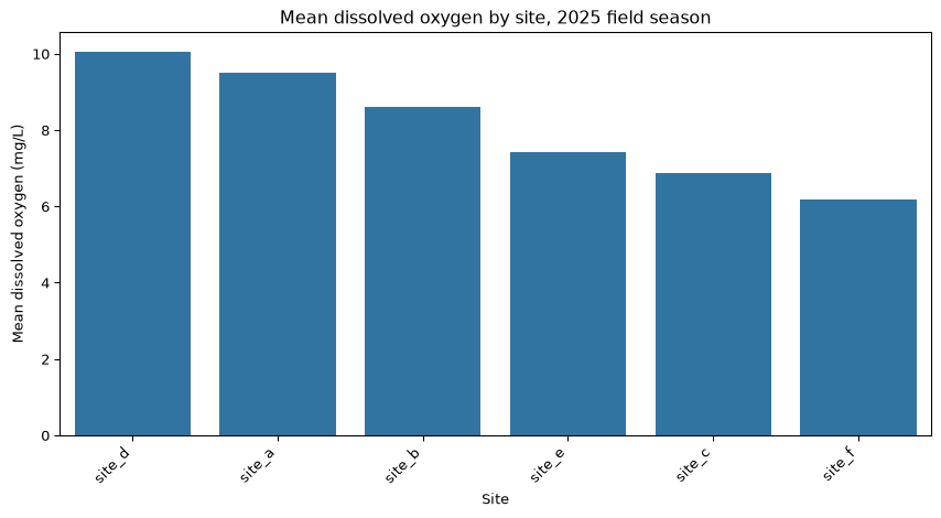
plt.figure(figsize=(9, 5))sns.barplot(x=mean_do.index, y=mean_do.values)plt.xlabel('Site')plt.ylabel('Mean dissolved oxygen (mg/L)')plt.title('Mean dissolved oxygen by site, 2025 field season')plt.xticks(rotation=45, ha='right')plt.tight_layout()plt.show()
figsize, labels, title, rotation, tight_layout. Same commands, different drawing call in the middle.
The division of labour is worth remembering: seaborn draws the marks and places them, and matplotlib provides the frame around them. When you want to change something about the data, change a seaborn argument. When you want to change something about the figure, use plt.
Note
🐍 seaborn has far more than three functions, and a sns.set_theme() call that restyles every figure in your notebook at once. Explore both when you have time! Three functions and hue= will get you through this course and a good deal of what comes after it, and they are worth knowing well before you collect any more.
Key points
A seaborn call looks like sns.function(data=df, x='col', y='col'). The table goes in whole and the columns are named as strings.
hue='col' splits any of these plots by a categorical column and builds the legend for you. It is the argument that answers does this relationship differ between groups?
sns.scatterplot for one measurement against another.
sns.histplot(data=, x=) for the distribution of a single column. No y=; the heights are counts.
sns.barplot(data=, x='category', y='value')silently computes a mean and draws an uncertainty interval you did not ask for.
Prefer the explicit route: .groupby(), aggregate, .sort_values(), then sns.barplot(x=series.values, y=series.index). You control the number and the order.
seaborn draws on matplotlib, so plt.figure(figsize=), plt.xlabel(), plt.title(), plt.xticks(rotation=) and plt.tight_layout() all still work.
A distribution that mixes groups looks wider than any group in it. Split it before you describe it.