This page covers the adjustments you make after a figure exists: sizing it, colouring it, labelling it, and making the labels readable. For the plotting commands themselves, see the matplotlib and seaborn cheatsheets.
Setup
Code
import pandas as pdimport matplotlib.pyplot as pltimport seaborn as snsmonths = ['Jan','Feb','Mar','Apr','May','Jun','Jul','Aug','Sep','Oct','Nov','Dec']temps = [-22.89, -20.70, -20.69, -11.76, -0.80, 8.59,11.22, 7.23, -0.11, -10.54, -18.34, -21.44]
Matplotlib Customization
Figure size
figsize is in inches, width then height. A wide, short figure suits a long time axis. A square one suits a scatter.
Code
plt.figure(figsize=(10, 4))plt.plot(months, temps)plt.ylabel('Mean air temperature (deg C)')plt.tight_layout()plt.show()
Colour, line style and markers
Code
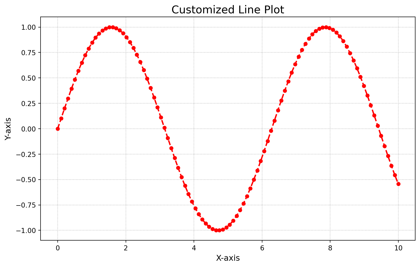
plt.figure(figsize=(8, 4))plt.plot(months, temps, color='firebrick', linestyle='--', linewidth=2, marker='o', markersize=5)plt.ylabel('Mean air temperature (deg C)')plt.tight_layout()plt.show()
Common values: colours by name ('firebrick', 'steelblue') or single letter ('r', 'b', 'g', 'k'); line styles '-', '--', ':', '-.'; markers 'o', 's', '^', '.'.
Axis labels and title
Axis labels should give units. A title should say what the figure shows, not repeat the axis names.
Code
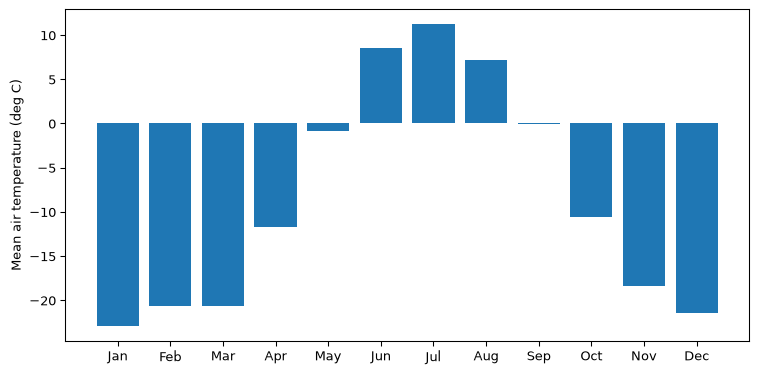
plt.figure(figsize=(8, 4))plt.bar(months, temps)plt.xlabel('Month')plt.ylabel('Mean air temperature (deg C)')plt.title('Toolik Lake, 2008 to 2019')plt.tight_layout()plt.show()
Rotating tick labels
When category names collide, rotate them. ha='right' aligns each rotated label under its own tick rather than beside it.
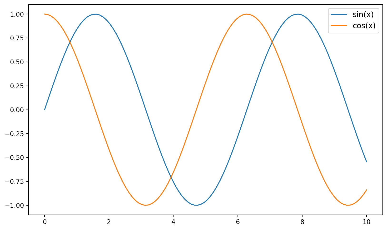
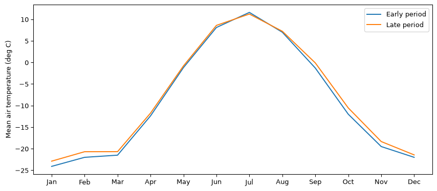
Label each series as you draw it, then call legend() once.
Code
early = [-24.1, -22.0, -21.5, -12.4, -1.2, 8.1, 11.6, 7.0, -1.3, -12.0, -19.5, -22.0]plt.figure(figsize=(9, 4))plt.plot(months, early, label='Early period')plt.plot(months, temps, label='Late period')plt.ylabel('Mean air temperature (deg C)')plt.legend()plt.tight_layout()plt.show()
Grid lines
Code
plt.figure(figsize=(8, 4))plt.bar(months, temps)plt.grid(axis='y', linestyle='--', alpha=0.7)plt.ylabel('Mean air temperature (deg C)')plt.tight_layout()plt.show()
Fixing crowded layouts, and saving
Code
plt.figure(figsize=(8, 4))plt.bar(months, temps)plt.ylabel('Mean air temperature (deg C)')plt.tight_layout() # keeps labels from being cut offplt.show()
plt.savefig('toolik_monthly.png', dpi=300) # call this before plt.show()
Seaborn Customization
Seaborn draws onto a matplotlib figure, so everything above still applies. Size the figure with plt.figure() first, then call seaborn, then label with plt.xlabel() and friends.
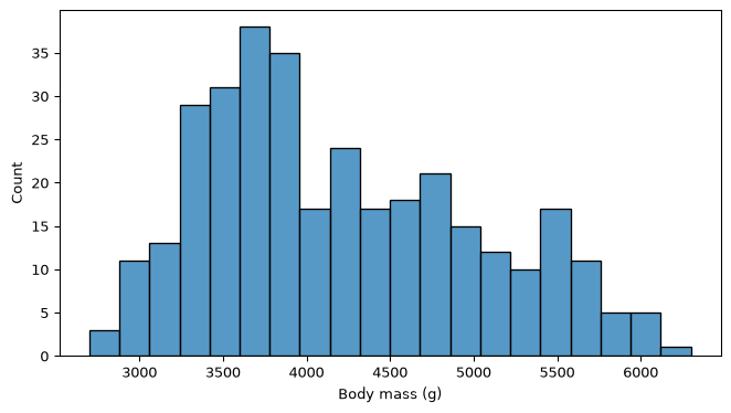
bins= controls how finely the range is divided. Too few bins hides structure and too many turns the figure into noise. Try a few.
Code
plt.figure(figsize=(7, 4))sns.histplot(data=penguins, x='body_mass_g', bins=20)plt.xlabel('Body mass (g)')plt.tight_layout()plt.show()
Ordering bars
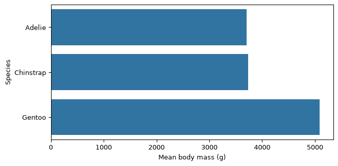
A bar chart of unordered categories is easier to read when you sort it first.
Code
mean_mass = penguins.groupby('species')['body_mass_g'].mean().sort_values()plt.figure(figsize=(7, 3.5))sns.barplot(x=mean_mass.values, y=mean_mass.index)plt.xlabel('Mean body mass (g)')plt.ylabel('Species')plt.tight_layout()plt.show()
Key Points
Size the figure first, plot second, label third, tight_layout() last.
Axis labels give units. A figure without them is not finished.
Prefer horizontal bars to rotated labels when the categories are words.
Sort a bar chart before you draw it.
savefig() goes before show(), because showing a figure clears it.
Beyond EDS 217
Not used in this course, listed so you recognize it elsewhere. Not run here.
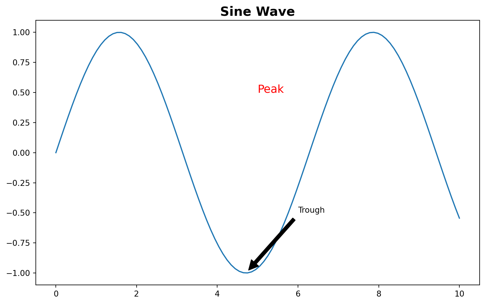
# Global styling: changes the look of every figure drawn afterwardssns.set_theme(style='whitegrid')sns.set_palette('deep')# Named colour palettes for a hue variablesns.scatterplot(data=df, x='a', y='b', hue='group', palette='Set2')# Text and arrows placed at a data coordinateplt.annotate('Trough', xy=(3, -1), xytext=(6, -0.5), arrowprops=dict(facecolor='black', shrink=0.05))# Manual tick positionsplt.xticks([0, 2, 4, 6, 8, 10])plt.ylim(-30, 15)# Several panels in one figurefig, (ax1, ax2) = plt.subplots(1, 2, figsize=(12, 5))
See the seaborn cheatsheet for the seaborn functions this course does not use.