Since then we have spent six days getting data ready: imported, filtered, sorted, cleaned, transformed, grouped, aggregated, joined, and reshaped. .
This morning we finally turn our tables into pictures.
By the end of this morning’s first session you will be able to:
name the two objects every matplotlib picture is made of, the figure and the axes
control the size and shape of a figure with plt.figure(figsize=)
label a figure so that someone can understand what it depicts
put two series on one set of axes and tell them apart with a legend
fix one of the most common cosmetic problems in plots: unreadable tick labels, with plt.xticks(rotation=) and plt.tight_layout()
explain when a figure can be honest and still useless, and decide what to plot instead
Getting Started
Create the file. In the Explorer, hover over the EDS217 heading and click New File…, then type the name in full, extension included: Session_7A_Matplotlib.ipynb
Check the kernel. The Kernel Selector in the notebook’s action bar should read Python 3.11.15 (Conda: eds217). If it reads anything else, click it, choose Change Kernel, and pick the eds217 entry.
Add a title cell. Click + Markdown in the action bar, and give it this content, with today’s date:
# Day 7: Session 7A - The Anatomy of a Figure[Session Webpage](https://eds-217-essential-python.github.io/course-materials/interactive-sessions/7a_matplotlib.html)Date: 09/09/2026
Save with Ctrl + S (Cmd + S on macOS), and keep saving as you go.
Rebuild yesterday afternoon’s Toolik table. Every line below is one you wrote in 6C:
Code
import pandas as pdimport matplotlib.pyplot as plturl ='https://eds-217-essential-python.github.io/data/toolik_weather.csv'toolik = pd.read_csv(url)toolik['date'] = pd.to_datetime(toolik['Date'], format='%Y%m%d')toolik['year'] = toolik['date'].dt.yeartoolik['month'] = toolik['date'].dt.monthtoolik.shape
(11171, 24)
We end up with our usual 11,171 days of Arctic weather, now including a real date column we can group by.
The picture you already made
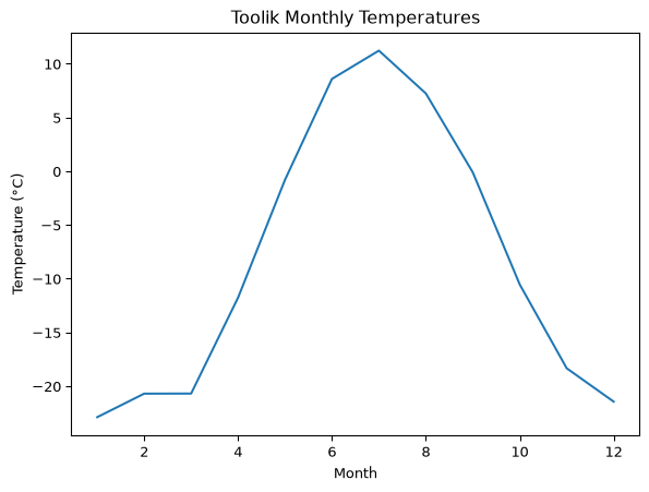
Rebuild the twelve numbers from Day 1, and draw them the same way you drew them then:
The result is a perfectly good figure, and on Day 1 none of us knew what any of those five lines were doing. Now let’s dig into the two objects those five lines are drawing on.
Figure and axes
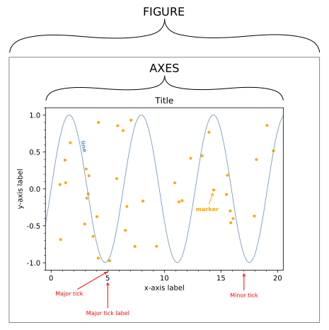
Every matplotlib picture is two nested objects.
The figure is like a gallery wall: a rectangle of a certain size, in inches, onto which every frame gets hung. The axes is the picture frame: it defines a region where data can be placed, together with its ticks, its tick labels, its axis labels and its title.
One figure (gallery wall) can hold several axes (picture frames). In this course, every figure you make will hold exactly one of them.
You did not create either object in the cell above. plt.plot() found no figure open, so it made one with default settings and then created axes, and then it drew inside them.
Every plt command after that went to the same figure.
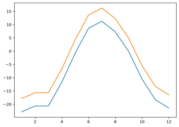
This convenience has a cost. If you run two plotting cells without saying where one figure ends and the next begins, both sets of data are drawn onto the same axes:
Two lines, one axes, and no warning that it happened. Sometimes drawing two series together is exactly what you want, and we will do it on purpose when we get to legends. However, when it is not what you want, plt.figure() is how you say create a new place for my data (make a new gallery wall!)
Note
🐍 plt.show() is the line that says this figure is finished, draw it. In a Jupyter notebook you can usually leave it out and the figure still appears at the end of the cell. Type it anyway! It makes the boundary between one figure and the next explicit, and it stops the notebook printing a line of matplotlib internals above your picture.
Size and shape: plt.figure(figsize=)
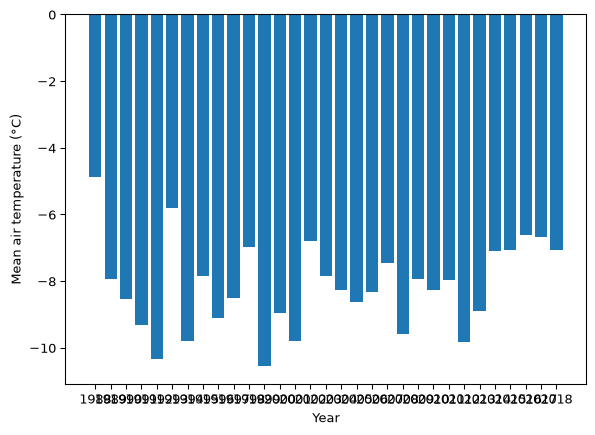
Here is a figure the default settings do not suit. Thirty-one annual mean temperatures, drawn as bars:
Code
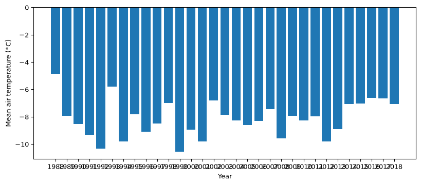
annual_means = toolik.groupby('year')['Daily_AirTemp_Mean_C'].mean()plt.bar(annual_means.index.astype(str), annual_means)plt.xlabel('Year')plt.ylabel('Mean air temperature (°C)')plt.show()
The data is fine, but the picture is not: thirty-one year labels have been crammed into six and a half inches and the x-axis has turned into a smear of ink.
The default matplotlib figure is 6.4 inches wide and 4.8 inches tall, which is a reasonable rectangle for a scatter plot,but often the wrong aspect ratio for anything with a lot of labels along the bottom. plt.figure() takes a figsize= argument, a tuple of (width, height) in inches, and it must come before the plotting command it applies to:
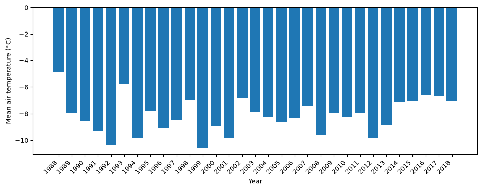
plt.figure(figsize=(10, 4))plt.bar(annual_means.index.astype(str), annual_means)plt.xlabel('Year')plt.ylabel('Mean air temperature (°C)')plt.show()
This is the same data, and the same four lines of drawing code, but now the labels have room. A wide, short figure is usually the right shape for anything with time along the bottom, which in environmental data science is a lot of what we plot.
✏️ Test your knowledge
Filter toolik to a single year of your choosing, then draw its daily mean air temperature as a line with date on the x-axis. Draw it twice: once with no plt.figure() call at all, and once inside a figure twelve inches wide and four inches tall. Give the second one an x-label, a y-label and a title.
Which of the two figures would you put in a report, and what specifically is wrong with the other one?
Tick labels that do not fit
Widening the figure (larger wall!) buys us room. But often there is no more room to buy, because the labels themselves are long: dates, station names, species names, states.
The easiest fix is to rotate them. plt.xticks(rotation=45, ha='right') rotates every tick label on the x-axis by 45 degrees and anchors its horizontal alignment at its right-hand end, so the label ends underneath the tick it belongs to instead of drifting off to the side.
Code
plt.figure(figsize=(10, 4))plt.bar(annual_means.index.astype(str), annual_means)plt.xticks(rotation=45, ha='right')plt.xlabel('Year')plt.ylabel('Mean air temperature (°C)')plt.tight_layout()plt.show()
This code block introduces two new tools, and they are both are worth creating as habits.
plt.tight_layout() goes last, after everything else has been added. Rotated labels stick out further than upright ones, and matplotlib will crop them off the bottom of the figure rather than make room for them; tight_layout() measures whatever you actually drew and resizes the axes so that all of it fits.
Add it to any figure with rotated labels, long axis labels, or a title that runs to two lines.
Note
🐍 rotation=90 stands the labels straight up and needs no ha=. It is more compact than 45 degrees, but it is also harder to read. Use 45 unless you are desperate for width.
✏️ Test your knowledge
Build a Series holding the number of non-null Daily_Precip_Total_mm readings in each year, using .count() on a grouping by year. Draw it as bars in a figure ten inches wide and four tall, with the year labels rotated 45 degrees, and finish the cell with plt.tight_layout(). Label both axes and title it.
Then, in a markdown cell: name the four years you would refuse to put into an annual precipitation total.
Labels are not decoration
Every figure in this course needs three things:
plt.xlabel('what is along the bottom, with units')plt.ylabel('what is up the side, with units')plt.title('what this figure is of')
The reason is not tidiness. A figure without labels is a picture whose meaning lives in the head of whoever made it… which means it stops meaning anything to anyone else… including you in three weeks! Temperature (°C) takes a few seconds to type, so you should always add labels, even to preliminary figures.
The units matter as much as the words. trange_min is not a label. Minimum winter temperature (°F) is.
Two series, one axes, and a legend
Yesterday afternoon we split the Toolik record into its first eleven years and its last ten years, and compared them month by month. Let’s rebuild that table:
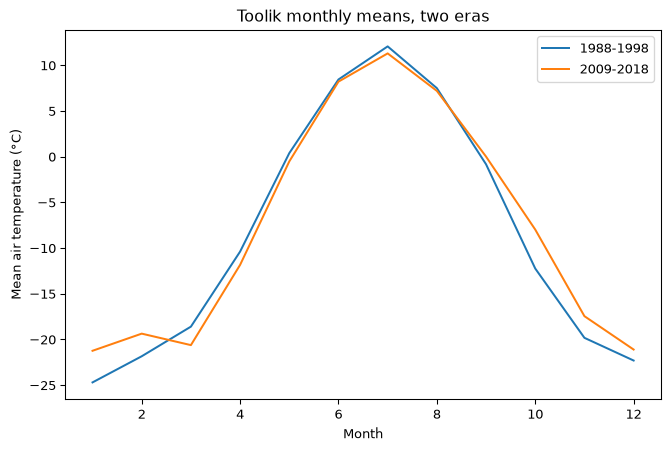
Now let’s plot both eras on one axes. Two plt.plot() calls with no plt.figure() between them draw onto the same axes, which is the stacking we saw earlier in the session and is exactly what we want now. Give each line a label=, then call plt.legend() once to draw the key:
Code
plt.figure(figsize=(8, 5))plt.plot(comparison.index, comparison['early'], label='1988-1998')plt.plot(comparison.index, comparison['late'], label='2009-2018')plt.xlabel('Month')plt.ylabel('Mean air temperature (°C)')plt.title('Toolik monthly means, two eras')plt.legend()plt.show()
plt.plot(x, y, label='what this line is') # once per seriesplt.legend() # once per figure
The label= argument says what a series is called. plt.legend() collects every label on the axes and draws the key. Miss the plt.legend() line and no key appears at all; miss a label= on one of the series and the key is drawn without it, and without an error to tell you so.
When a figure is honest but still useless
Look at the figure you just made and ask what it shows.
It shows that Toolik is cold in winter and less cold in summer, which we already knew. The two eras sit almost on top of each other. If somebody handed you the figure and claimed the site had changed, you would probably not believe them.
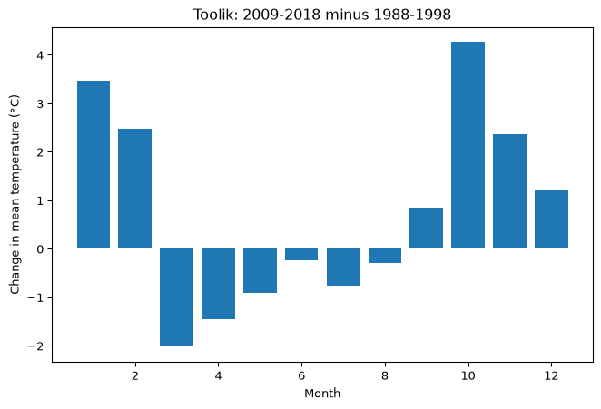
Now look back at the change column in the table. January is 3.5 °C warmer, October is 4.3 °C warmer, and July is 0.8 °C cooler. The changes are real and worth reporting, and the figure we just drew makes none of them visible.
Nothing is wrong with the figure. The problem is that the quantity you care about is a difference of a few degrees, and you have drawn it on an axis that has to span nearly thirty-seven degrees to fit the seasonal cycle. The signal is about a tenth of the axis.
So plot the thing you actually care about. The difference is already a column:
Code
plt.figure(figsize=(8, 5))plt.bar(comparison.index, comparison['change'])plt.xlabel('Month')plt.ylabel('Change in mean temperature (°C)')plt.title('Toolik: 2009-2018 minus 1988-1998')plt.show()
There it is. Tall positive bars in January, February, October, November and December, a short positive one in September, and negative bars from March through August.
Zero is the line the bars hang from, so the sign of each month is readable at a glance. The cold-season warming that took us a table and a paragraph yesterday is readable here in a single look.
This is the whole job
Choosing what to plot is a larger decision than choosing how to plot it. Both figures above are correct, but only one of them answers a question.
When a figure looks like nothing is happening, do not reach for a bigger figure or a brighter colour. Ask what quantity your question is actually about, compute that quantity as a column, and plot it.
✏️ Test your knowledge
Build a table of mean Daily_Precip_Total_mm by month for the early and late eras, exactly as comparison was built for temperature, and add a change column.
Then make two figures: the two eras as two labelled lines with a legend, and the change on its own as bars. Both need a title, both axes labelled with units.
In a markdown cell, say which of the two figures you would show somebody, and whether the precipitation story is as clean as the temperature one.
Points instead of lines
plt.plot() draws a line through your points in the order they appear, which is right when the x-axis is time or anything else with an order… but generally a bad idea otherwise. When you are plotting one measurement against another, use plt.scatter():
Code
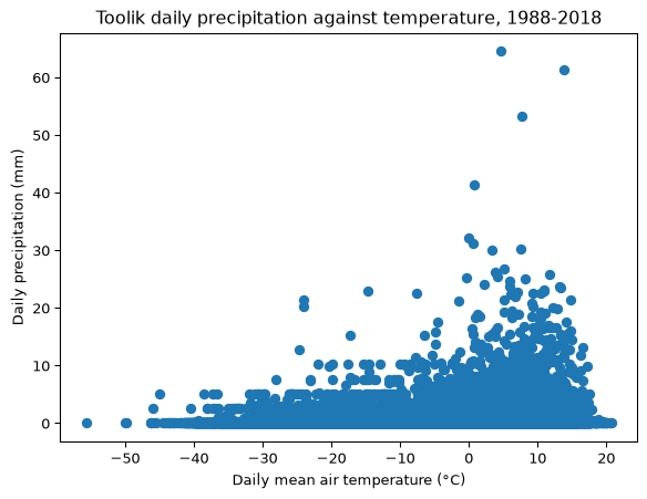
wet_days = toolik.dropna(subset=['Daily_Precip_Total_mm'])plt.figure(figsize=(7, 5))plt.scatter(wet_days['Daily_AirTemp_Mean_C'], wet_days['Daily_Precip_Total_mm'])plt.xlabel('Daily mean air temperature (°C)')plt.ylabel('Daily precipitation (mm)')plt.title('Toolik daily precipitation against temperature, 1988-2018')plt.show()
Every day with a precipitation reading, 10,751 of the 11,171, is a dot. Most days are dry whatever the temperature, so the bottom of the plot is a solid band. The wettest days are the informative part: the largest totals all sit in the warmer half of the range, and below about −20 °C nothing gets past a few millimetres. Cold air has a very low saturation vapor pressure, and this plot shows that it’s hard for very dry air to generate substantial rainfall.
plt.scatter() takes x and y in the same order plt.plot() does, and everything you have learned this session works on it unchanged: figsize, labels, title, legend, rotation, tight_layout.
The drawing command changes, but the figure and the axes underneath it do not.
Note
🐍 Ten thousand overlapping dots is a lot of ink for what they show, and matplotlib gives you a pile of keyword arguments for controlling colour, marker shape and transparency to deal with it. You will not need most of them. In the next session we meet seaborn, which draws a better version of this same plot straight from the DataFrame, in one line.
Key points
Every matplotlib picture is a figure (the canvas) containing an axes (where the data goes). You get both for free if you do not ask for them.
plt.figure(figsize=(width, height)) sets the canvas size in inches, and must come before the plotting call.
Plotting commands with no plt.figure() between them stack on the same axes. Stacking is a feature when you want two series in one picture and a bug when you do not.
Always label: plt.xlabel(), plt.ylabel(), plt.title(), with units in the axis labels.
Two series on one axes need a label= on each and one plt.legend() call.