🎉🎉 Congratulations! You made it to the end of a Python data science workflow…🎉🎉
🎉🎉..and the end of the first day of EDS 217!! 🎉🎉
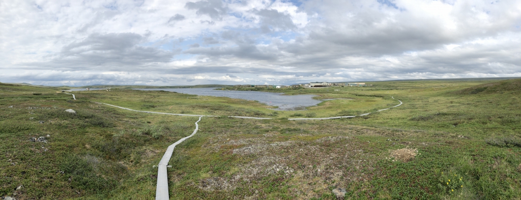
Toolik from the boardwalk (source)[https://media.arcus.org/album/polartrec-2019-alejandra-martinez/30679]
In this exercise, you will work with climate data using the Python data science workflow. You’ll load the data into a pandas DataFrame, perform basic exploration and cleaning, and create visualizations. This hands-on practice will help you understand how Python can be used for data analysis, with comparisons to similar tasks in R. Think of this as a movie trailer for the skills you’ll build over the next week.
You’re not expected to understand every line of code today. By next Friday, you’ll know exactly how all of this works. For now, just enjoy the ride and see what’s possible!
Our data comes from the Arctic Long Term Ecological Research station. The Arctic Long Term Ecological Research (ARC LTER) site is part of a network of sites established by the National Science Foundation to support long-term ecologicalLooking South of Toolik Field Station research in the United States. The research site is located in the foothills region of the Brooks Range, North Slope of Alaska (68° 38’N, 149° 36.4’W, elevation 720 m). The Arctic LTER project’s goal is to understand and predict the effects of environmental change on arctic landscapes, both natural and anthropogenic. Researchers at the site use long-term monitoring and surveys of natural variation of ecosystem characteristics, experimental manipulation of ecosystems (years to decades) and modeling at ecosystem and watershed scales to gain an understanding of the controls of ecosystem structure and function. The data and insights gained are provided to federal, Alaska state and North Slope Borough officials who regulate the lands on the North Slope and through this web site.
We will be using some basic weather data downloaded from Toolik Station:
I have already downloaded this data and placed in our course repository, where we can access it easily using its github raw url.
Let’s dive into the exercise!
| What you’ll see today | When you’ll learn it | What we’ll cover |
|---|---|---|
import pandas as pd |
Day 3-4 | Data structures and DataFrames |
pd.read_csv() |
Day 4 | Loading data from files |
df.head(), df.info() |
Day 4 | Data exploration methods |
df.groupby() |
Day 6 | Data aggregation and grouping |
plt.plot(), plt.bar() |
Day 7 | Data visualization |
Import Libraries
pandas) and create plots (matplotlib.pyplot). Use the standard python conventions that import pandas as pd and import matplotlib.pyplot as plt🎬 Copy and paste this code:
import pandas as pd
import matplotlib.pyplot as plt
What just happened? We imported two powerful libraries! pandas is like Excel but supercharged for data analysis, and matplotlib creates beautiful(ish) plots. 🎓 Coming up: You’ll learn about Python imports and libraries on Days 2-3.
Load the Data
Our data is located at:
https://raw.githubusercontent.com/environmental-data-science/eds217-day0-comp/main/data/raw_data/toolik_weather.csv
url that stores the URL provided above as a string.read_csv() function from pandas to load the data from the URL into a new DataFrame called df. Any pandas function will always be called using the pd object and dot notation: pd.read_csv().The read_csv() function can do a ton of different things, but today all you need to know is that it can take a url to a csv file as it’s only input.
🎬 Copy and paste this code:
url = 'https://raw.githubusercontent.com/environmental-data-science/eds217-day0-comp/main/data/raw_data/toolik_weather.csv'
df = pd.read_csv(url)This is just like df <- read.csv(url) in R! Both pandas DataFrames and R data.frames are tabular data structures. The main syntax difference is Python’s dot notation: pd.read_csv() vs R’s read.csv(). Both can read directly from URLs, which is incredibly convenient for reproducible research!
What just happened? We loaded over 15,000 rows of climate data from the internet in one line! The data is now stored in a “DataFrame” called df. 🎓 Coming up: Day 4 will teach you all about loading and working with data files.
Preview the Data
head() method to display the first few rows of the DataFrame df.🎬 Copy and paste this code:
df.head()Because the head() function is a method of a DataFrame, you will call it using dot notation and the dataframe you just created: df.head()
What just happened? We previewed the first 5 rows of our 15,000+ row dataset! You can see daily weather measurements from Alaska. 🎓 Coming up: Day 4 morning will teach you data exploration methods like this.
This is exactly like head(df) in R! The key difference is Python’s object-oriented approach: df.head() vs R’s functional approach head(df). Both show you the first few rows, but Python treats the DataFrame as an object that has methods (like .head()) built into it.
Check for Data Quality
isnull() method combined with sum() to count missing values in each column.🎬 Copy and paste this code:
df.isnull().sum()What just happened? We checked every column for missing data! Looks like our temperature data is complete (0 missing values), which is great. 🎓 Coming up: Day 5 will teach you all about data cleaning and handling missing values.
In R, you’d use sum(is.na(df)) to count missing values. Python uses df.isnull().sum() - notice the chaining of methods! This reads left-to-right: “take the DataFrame, check for null values, then sum them up.” Both approaches give you the count of missing values per column.
You should see that the Daily_AirTemp_Mean_C doesn’t have any missing values. This means we can skip the usual step of dealing with missing data. We’ll learn these tools in Python and Pandas later in the course.
Get Data Summary Statistics and Data Descriptions
describe() method to generate summary statistics for numerical columns.info() method to get an overview of the DataFrame, including data types and non-null counts. Just like the head() function, these are methods associated with your df object, so you call them with dot notation.🎬 Copy and paste this code:
df.describe()
df.info()
What just happened? We got instant statistics and information about our entire dataset! You can see temperature ranges, averages, and data types. 🎓 Coming up: Day 4 will teach you how to explore and understand your datasets.
These are like summary(df) and str(df) in R. Python’s .describe() gives you the statistical summary (like summary()) while .info() shows the structure (like str()). Notice how Python uses dot notation - the DataFrame object has these methods built in, whereas R uses separate functions that take the data frame as input.
Now for some real data analysis - let’s find average temperatures by month!
🎬 Copy and paste this code:
monthly = df.groupby('Month')
monthly_means = monthly['Daily_AirTemp_Mean_C'].mean()
What just happened? We grouped 15,000+ daily temperature readings by month and calculated averages! This turned years of daily data into 12 monthly summaries. 🎓 Coming up: Day 6 will teach you all about grouping and aggregating data like this.
This is exactly like using df %>% group_by(Month) %>% summarize(mean_temp = mean(Daily_AirTemp_Mean_C)) in dplyr! Both approaches group data and calculate statistics. Python’s syntax is df.groupby('column')['target_column'].function(), while R uses the pipe operator %>% to chain operations. Both are powerful for data aggregation!
You can do analysis on a specific column in a dataframe using [column_nanme] notation: my_df["column A"].mean() would give the average value of “column A” (if there was a column with that name in the dataframe). In the coming days, we will spend a lot of time learning how to select and subset data in dataframes!
Time to turn numbers into pictures! Let’s plot the monthly temperature patterns.
🎬 Copy and paste this code:
plt.plot(monthly_means)Now let’s make it even better with labels:
months = ['Jan','Feb','Mar','Apr','May','Jun','Jul','Aug','Sep','Oct','Nov','Dec']
plt.bar(months, monthly_means)
What just happened? You used a basic plotting function to make a data visualization. The bar chart clearly shows Alaska’s extreme seasonal temperature differences. 🎓 Coming up: Day 7 will teach you how to create amazing visualizations and customize them.
This is like creating plots with ggplot(df, aes(x=Month, y=temp)) + geom_bar() in R! Python’s matplotlib uses a more direct approach: plt.plot() and plt.bar() create plots immediately. Both are powerful - ggplot2 uses a “grammar of graphics” approach while matplotlib is more imperative. You’ll learn both have their strengths!
Let’s explore how temperatures have changed over the decades!
🎬 Copy and paste this code:
year = df.groupby('Year')
yearly_means = year['Daily_AirTemp_Mean_C'].mean()
plt.plot(yearly_means)
And as a bar chart:
year_list = df['Year'].unique()
plt.bar(year_list, yearly_means)
What just happened? You analyzed climate trends across multiple decades! You can see how Arctic temperatures have varied over time - real climate science! 🎓 Coming up: This combines Day 6 skills (grouping data) with Day 7 skills (visualization).
This is just like grouping by year in R and plotting the results! Whether you use df %>% group_by(Year) %>% summarize() in R or df.groupby('Year').mean() in Python, you’re doing the same analytical thinking. The syntax differs, but the data science concepts are identical.
Data scientists always save their analyses for future use.
🎬 Copy and paste this code:
monthly_means.to_csv("monthly_means.csv", header=True)What just happened? You saved your analysis results to a file that you (or other scientists) can use later! This is how research becomes reproducible. 🎓 Coming up: Day 4 will teach you all about importing, exporting, and managing data files.
This is just like write.csv(monthly_means, "monthly_means.csv") in R! Python uses the object-oriented approach where the data (your Series monthly_means) has a method .to_csv() built into it. R uses a function that takes the data as input. Both create the exact same CSV file - just different syntax approaches to the same goal.
to_csv() Output:If you inspect the monthly_means.csv file using the file browser in JupyterLab, it will look something like this:
Month,Daily_AirTemp_Mean_C
1,-20.561290322580643
2,-23.94107142857143
3,-17.806451612903224
4,-15.25294117647059
5,-0.8758190327613105
6,8.76624We will spend the rest of the course learning more about each of the steps we just went through. And of course, we have a lot more to learn about the essentials of the Python programming language over the next 8 days of class.
Take some time now to reflect on what you’ve learned today, and to add some additional comments and notes in your code to follow up on in the coming days.
By the end of the course you will be writing your own Python data science workflows just like this one… hopefully many of the “code strangers” you’ve just met will have become good friends!
🎉🎉 Congratulations! You made it to the end of a Python data science workflow…🎉🎉
🎉🎉..and the end of the first day of EDS 217!! 🎉🎉
End Activity Session (Day 1)